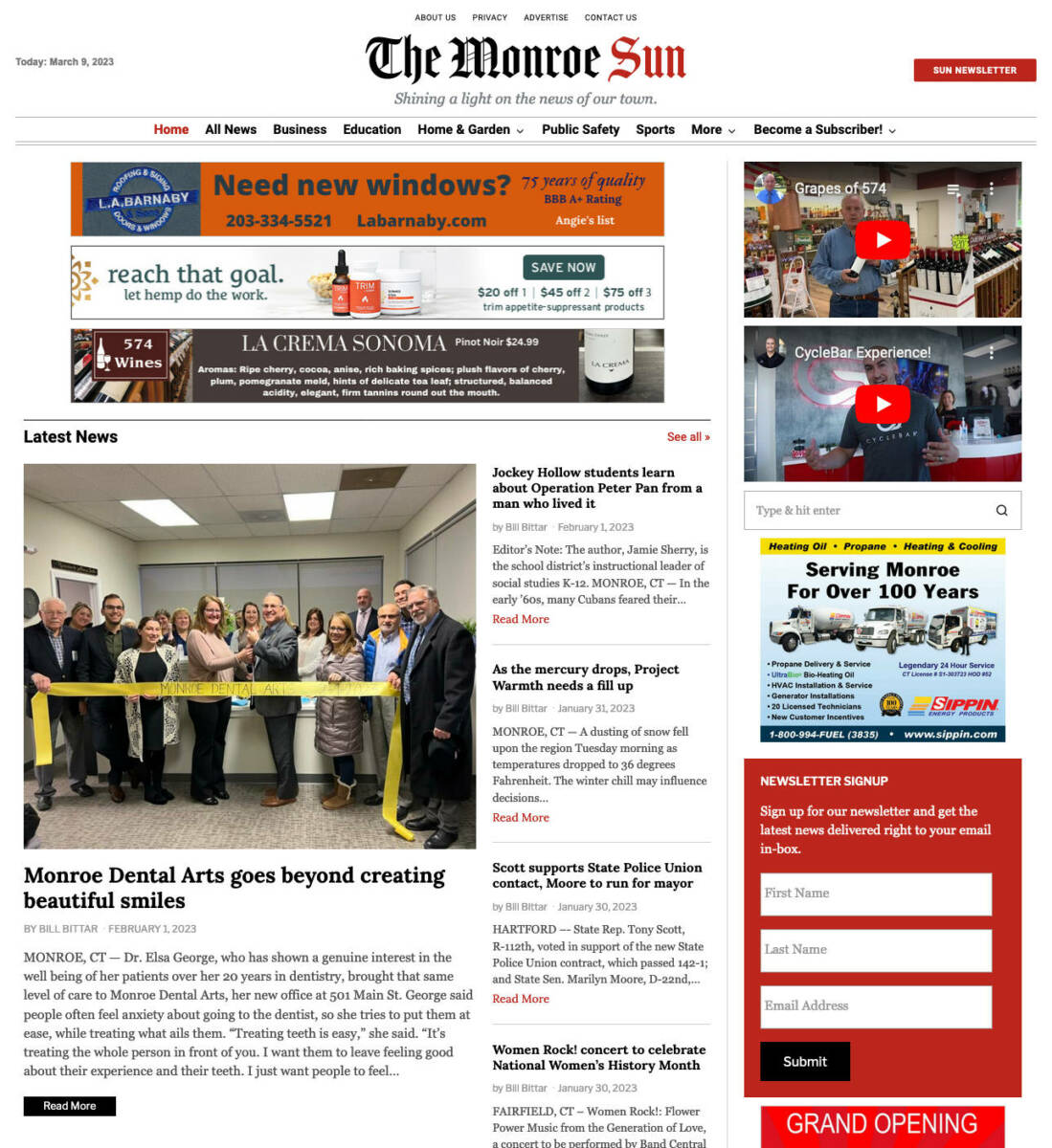
The Monroe Sun will roll out a new look by early Monday morning, allowing us to tell the stories of Monroe people, places and things in a more visually pleasing way, with the layout of a traditional newspaper and creative design features seen in magazines.
Currently, all Sun articles have a main photo, headline and text, sometimes with other photos and videos. Our new theme will offer more design options.
Subheads under headlines can provide more context and photo galleries and a video can run as the lead art, rather than further down the page.
The new design will be more noticeable on personal computers, laptops and tablets, though cellphone users will still see a noticeable difference.
 We decided to upgrade to a new theme to ensure better maintenance of the site and to give you more, from the number of articles displayed to more creative story layouts.
At 8 p.m. this Sunday, the site will be down for an hour or two, while switching to the new design.
More stories on display
While The Sun’s current layout simply shows a list of stories on the homepage, the new look will highlight more stories, making it easier for readers who haven’t visited in a while to catch up on what they missed. (Cellphones will still display a single list due to space.)
To access the homepage, go directly to themonroesun.com, or click on home or on The Monroe Sun logo above an article.
“Latest News” highlights the most recent article with a photo and smaller headlines of four other stories run to the right of it. “See All” at the top right corner leads to a full listing of story links in the category.
Categories can still be accessed from the menu bar at the top of the page, but the new design highlights the most read categories, featuring the last five stories.
Scrolling down the page, the Business category displays the latest story with a photo, along with the four most recent stories.
The next highlighted category is Sports, which has the same design.
Below that, three more categories are featured running across the page with three featured stories with headlines and photos, including Education, Public Safety and Home & Garden.
After clicking on a story, The Sun’s current design shows “Read Next” with one highlighted article.
The new design has “You Might Be Interested In” with three recent stories. Keep scrolling down and five more stories are highlighted under Latest News.
Creative layouts
Among the creative flourishes The Sun will now have is the drop cap, when the first letter in a story is bold and larger, dropping down four lines into the text, giving a feature story the look of a magazine layout.
Another feature is the pull quote, a highlighted quote pulled out of an article and displayed in larger font with the name of the person who said it.
The new design also includes a post style called “Hero Full” which allows headlines to run on top of the main photo in white lettering, providing an occasional break from the traditional black font headline over or under the main photo.
We are excited about these new changes and hope you will be too!
All respectful comments with the commenter’s first and last name are welcome.


So how does one get regular feeds whenever you publish without having to rely on your sporadic postings on Facebook? Your “Become a Subscriber” link just points to sponsorship opportunities.
Hi Jay,
Thanks for reaching out. The Monroe Sun can be visited directly at themonroesun.com, which could be saved to your favorites. You could also sign up for a free email subscription by clicking here to receive daily updates: https://themonroesun.com/signup-for-the-monroe-sun-newsletter/
That’s what I was looking for, Bill! You might want to add that option to your “Become a Subscriber” link.
Thanks Jay, I already have one. It’s the red button to the right of the Monroe Sun logo.
Excited to see the new format Bill, thank you for the work you do covering Monroe.
Bill, your new format is excellent. It’s now much easier to scan through all the articles and utilize the sections listed at the top the of page. Your new banner heading gives the paper a very classic look.
Thanks Dee Dee and BJ! The main thing that attracted me to it was the more traditional newspaper look